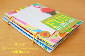
I have been "pretty" good in regards to scrapbook supply shopping lately. I'm sure my husband would not agree with that statement, but my purchases have been confined to projects or specific pages. I haven't indulged in picking up a bunch of stuff just because I fell in love with it and with nothing in particular in mind.
Well that all changed when I came across the Amy Tangerine Sketchbook collection at my local Joann's!!! I have been in love with this whimsical, bright, happy collection since day one. But to really indulge in it, I knew I would have to go all out and pick up almost everything. One or two pieces of paper would definitely not do. I know, I tried and then loved them so much and thought they were so special I was afraid to use them or the package of die cuts I was hording.
Two sided pieces of paper and embellishments add up at Archiver's, my favorite place to indulge in my drug of choice...anything scrappy related. But I totally could pick up everything I had to have at Joann's plus it was all 30% off! I'm in love with it all, just as I knew I would be. I didn't pick up a couple more things, like a Daybook, I wanted but I plan to soon.
Some more stuff I picked up lately, are these adorable stamp sets from Doodlebug Design Inc., as you all know probably my favorite scrapbook company overall. These were on clearance at Michael's for just $2.99 each! I did a double take when I saw them. I have two of their other sets and paid $9.99 for each of them at Archiver's, and at ten bucks a pop I really thought they were a pretty good deal. I was ecstatic to be able to snap these up.
Speaking of snapping, isn't this appetizer plate super cool? I found it while wandering around Target and couldn't resist getting one. I have no idea what I will do with it. I certainly didn't need it. But sometimes you just gotta.
Moving on from recent purchases to some I hope to make soon...warning, get ready for a lot of !!!
I can't even begin to describe how badly I want this new Sn@p! collection from Simple Stories! The bright primary colors are perfect for scrapping both my girly girl and my little guy. These 3X4 cards are perfect for the Simple Stories binders, I already have one and plan to get more, and I know a few will turn up in Project Life. This is totally the collection I would design for myself I could.
Like I mentioned above, I have one of these 6X8 binders, but it is so not as cute as this! It has a plain black binding and I remember telling an Archiver's employee that I really wished they came in colors. I guess sometimes dreams do come true. And the variety of colors...oh my!!!
Besides the 3X4 cards they ave 4X6, monthly cards, a collection designed for their 12X12 pages...wow it's a lot! These stickers are so stinkin' cute I want them all and the label stickers are so versatile I think I'll need multiples.
See the whole collection at Simple Stories.
What has been your most favorite recent scrapbook related addition? CHA recently happened, are you looking forward to any new lines as much as I am?
Friday, August 31, 2012
Thursday, August 30, 2012
A Crafty Soiree #105
Wow, you all out did yourselves this week! I can't tell you how many projects I had to ooh and ah at. I'm so happy you choose to share with us each week and love the inspiration I get from you! The best projects can always be found right here:) Before we get to this week's features, I wanted to direct your attention to the snazzy new button on my side bar....
I'm really looking forward to our month long September Celebration of one year of A Crafty Soiree! Malia and I are very excited and have some very special things planned for all our party goers like awesome giveaways for cute clothes, good recipes, beautiful stationery, and crafy eguides that will keep you busy creating for a long time! Plus I may have put together a sweet little giveaway gift pack of my own :) Please grab a button and spread the word and plan to enter our exciting giveaways each week in September!
Featured Projects:
Take A Long Pony House from Rasing Up Rubies: This is the most darling way to store and transport your favorite pony friends! I want one!
Ephemera Elephant Card Tutorial and Template from Rook No. 17: This is the cutest little card and perfect for using up your paper scraps and Jenn has made it easy for you to recreate it with a handy template. Love this!
Chocolate Raspberry Sugar Cookie Tart from It's Always Autumn: I love picking raspberries and while they are so sweet and delicious right off the vine this is a really lovely looking way to savor them. And who can say no to chocolate? I certainly can't.
Reusable Food Storage Covers from A Rosie Sweet Home: This is such a great idea, it cuts down on waste and makes everything prettier and that's always a good thing in my book. A tutorial is provided so you can make your own set.
Girls Camp Crafts from Second Chances by Susan: I couldn't not believe all the fabulous ideas Susan had for crafting with the girls over summer. There are several great ideas and she shares her tips too. This is one to bookmark for next Summer or to get ideas for keeping busy in the winter.
Party Guidelines
1. Link up to four of your creative projects (No Etsy stores or other linky parties pretty please).
2. Add your link to the specific posts not the main URL.
3. Add a "Crafty Soiree" button to your blog or posts.
4. Please comment on the post linked up in front of you. All partygoers love meeting new friends... don't just stop there...if you see something that catches your fancy-- stop by and say hi!
5. Your hostesses would love it if you'd follow us. You can find Malia here.
Wednesday, August 29, 2012
Review & Giveaway: Betty Crocker® Cereal Muffin Mixes
We got the new Betty Crocker® Cereal Muffin Mixes in the mail recently and ER picked the Cinnamon Toast Crunch® to make first. They were so yummy, we gobbled them up! As soon as ER finished one she wanted another. Watching her eat them, LB started getting all excited failing his arms and trying to reach for one too. I wasn't sure how the cinnamon would go over with a baby, but he was so eager to try them we decided to give him his first taste of a muffin. He loved them too and ate the entire thing!
Now we are very anxious to try the other two varieties Cocoa Puffs® and Reese´s® Puffs, also inspired by favorite Big G cereals. With the kids back in school or heading there soon, I think they are a great re-mix on your favorite breakfast cereals and a great alternative. They whip up easily and are definitely more portable than cereal and milk!
Try them now and save with this coupon for $.80 off one package of any variety of Cereal Muffin Mix.
Win It! Please use Rafflecopter below to enter for a chance to win an awesome prize pack and get to try all three new varieties of Betty Crocker® Cereal Muffin Mixes! The pack includes:
Box of Cinnamon Toast Crunch cereal muffins
Box of Cocoa Puffs cereal muffins
Box of Reese´s Puffs cereal muffins
Apron
Tumbler
Spoon
Therm O Snack
a Rafflecopter giveaway
Disclosure: The product, gift pack, information, and additional sample have been provided by Betty Crocker through MyBlogSpark.
Tuesday, August 28, 2012
Project Life Week 30
I'm really excited to share this week because it's when my baby turned one year old! I had so much fun combining both the Little Boy paper and digital collection (digital papers + elements) by Echo Park Paper Co. to make the party invitation and decorations. I made sure I saved some of the paper goodies to make my coordinating Project Life insert and love how it all turned out.
I used the Echo Park papers for the title card and little car filler. The blocked out area has LB's name on it made out of the cute letter stickers that come in the collection pack. The Olympics card is a Crashnotes freebie.
On this page are some photos I took at the kid's yearly doctor check up. Since ER was born on the 21st and LB on the 29th I combine the two and just go once. Digital Clementine journaling cards were used to add the major details.
I'm going to flip flop where LB's and ER's cards are and move hers up and his down. Then ER's info will be next to the picture she drew for the doctor at the appointment. She wrote her name on, which I had to clone out for posting, and I love the itty bitty baby LB on it. So cute! I'll have to make reprints so for now I'm leaving it as is.
Here's the 5X7 invitation I created digitally with the Echo Park kits I got from Jessica Sprague's website. I planned to develop them and mail out but time got away from me and I ended up emailing them. A bit tacky, I know! But since it was to family and friends I knew I could get away with it. But I did print out a few hard copies and this one was framed and on our mantle for the party.
Behind the invitation is a collage I made of some of the decorations and food. It's evidence of the downturn in photo quality Costco has been experiencing lately. I used to really like the prints but now that I'm doing PL I'm finding they cut things off my photos all the time. You can really tell in this one because the photo on the top right of the welcome sign looks wonky. Now you know I did not place it on the collage like that! I centered it very nicely and you can tell something happened during printing.
Anyway, I've yet to share pictures from the actual party but you can get a glimpse of the banner (created digitally), photo mat (cut out of paper sheet), welcome sign (digital), guest sign in board (digital), centerpiece lollipops (paper), dip sticks, and sandwich wheels we made for LB's transportation themed birthday.
Everything turned out great, it was better than expected. I even impressed myself :) I really must take the time to edit the pictures and share the party. As you can see it was really convenient being able to use a mix of the digital and paper supplies so I could really customize the party.
Here's the front side of the insert. I just did a summary type insert. I have already done several full 12X12 pages for LB's first year scrapbook, but I certainly couldn't skip mentioning such a big day in PL as well. This page was all made with the paper version of the collection.
I had some trouble with the two vertical pictures slipping so I stapled them in place and then used a paper strip to cover them up. The 29 on the brown circle is the date. I used my Cricut to cut out table scatter out of several sheets of patterned paper from the collection and saved a bunch when we were done. I turned two into a tab, stapling them to the top right photo. The All Boy sticker covers up the staple in the front.
This picture cracks me up because LB expression is so serious and it really looks like he's going to read the card first, before tearing into the presents.
The cake was amazing! And before you ask, no I sure did not make it. LB's Godmother and her family took care of the cake as part of his birthday present. She took a copy of the invitation into the bakery and they used it to make the matching border and sugar car. I was in awe it looks so good!
I didn't have a lot of captions and birthday pictures are pretty self explanatory so I opted to use the little alpha letters from one of the collection's sticker sheets directly on top of the page protector. With so much going on, all the color and the patterns, I like how the color blocked letters still stand out.
On the backside of the insert I added a couple pictures of guests, like the one of the Grandma's, i.e. my mom, Brad's mom, and my Godmother who is like a second mother to me. Then there's my good friend and LB's Godmother.
It was a nice day and the kids brought their water guns and had fun chasing each other around. I wasn't sure about sharing the pictures of the kids in their bathing suits so that's why I just took out most of that one. The edited picture at the top is of my God brother's son who shares my son's first name. So we call them B1 & B2. They are close in age and I hope they grow up friends, it will be nice for them to have company at the various gatherings throughout the year.
On the second half of the spread I represent the many trips to the endocrinologist I take a year to manage my diabetes. It's a boring picture but since management is a daily task I thought it should be at least mentioned in PL. Play dates, taking the new 4 in 1 Radio Flyer trike out for a spin around the neighborhood, the end of the library's summer reading program, and running errands with ER on the weekend round out the week.
I just have to point out this perfect journaling card I happened to have on hand. Can't beat a Radio Flyer trike card! Unfortunately, it was part of a page that I cut up awhile ago so I can't tell you the company's name. The Fresh Summer Day's card is by Simple Stories.
Fast forward to real life now, this is our last week of summer break. We go back next Tuesday and my little girl will be a first grader. I'm so upset our summer is over :( I'm in denial she's off to school all day long. I'm already sad she'll be away for so long and we won't have as much time to do our little projects, sing our songs, dance around the house...so if you hear loud crying next week...that will probably be me.
Linking up to The Mom Creative.
Monday, August 27, 2012
A Pocket Full Mini Album
The latest mini I've been working has got me more excited about creating than I have been for awhile. It was the perfect thing to get my crafting mojo back! Inspired by the eclectic look my Project Life album gets from a mix of page protectors and the idea of smashbooks, I wanted a project with lots of little places to stash things. Looking around my studio, my eyes spied a big stack of 9 pocket pages for organizing trading cards. Perfect!
I made the album base from thicker scrapbook papers, all from a MAMBI paper pad I picked up at Michaels. On the cover I mixed a variety of stickers and die cuts, layering them on with dimensional Zots. I didn't put adhesive on the larger die cuts so the cover photo can be slid underneath them.
Open up the book and you'll see the first spread, this one has two inserts a trimmed down page protector and a handmade pocket. I love how you can see glimpses of what's to come through the clear plastic. The "Keeping Cool" die cut is attached with dimentional Zots so you can slip a picture underneath it and leave a pretty pink border mat for the main picture.
I included three trimmed down page protectors throughout the album. Each has been cut down from nine pockets to four. Inside are a variety of 2.5"X3.5" papers. Some have been embellished a bit, others can have a little photo attached, and some can be left as filler cards.
This easy to make pocket is just a piece of paper folded up, the sides sealed with washi tape. It has a hint of glitter, so fun! I decided to reinforce the holes so it won't tear over time. I used a punch to make the opening and added a sheet of pink cardstock. You could add a longer story inside or remove the paper and put in longer keepsakes like concert tickets etc.
There are a couple of foil covered papers throughout the book, this check and the pink polka dots, which give it a cool metallic look. Only the bottom and sides of the green journaling card have been attached so a photo can be slipped under, or not. Just depends on your personal preference. An epoxy castle sticker's in the corner.
The yellow ice cream die cut is lifted up a bit and the popsicles are little brads, giving a hint of dimension. Love the washi tape attached mini picture space.
Die cut attached just along the top so a picture of a delicious meal or friends at your cook out can be added. You could also add your favorite BBQ menu here. I added the staples before gluing this page to the next so the prongs are hidden, smashing them down a bit gives them a smoother finish.
A tip for foil paper, make sure you know exactly where you want you pictures to be, before attaching. If you do and change your mind the sticky side will leave marks. I learned that the hard way, and that's why the cute beach ball is where it is :)
I have a couple of Whisker Graphics mini treat bags leftover from my son's first birthday party. We used them for the stop sign rice krispy treat favors we made. Those turned our super cute. The bags were also too sweet not to do something fun with them. They matched my theme so in they went into the project!
I left the back of this little mini plain white, thinking a larger photo attached overing the entire surface would look great. Used some Martha Stewart labels for someplace to add a few details, what on earth did I do before those came around? I use them all the time now!
You can slide something under the "Summertime" tag. I liked this page because the white provides a natural photo mat.
Now you know a little twine would also show up, didn't you?
Here's the other Whisker Graphics bag, this time it's a pocket on the page.
Here's how I finished off the back of the pocket, with a little photo mat and tag. I liked the big bold text paper too much to cover it up. I hope you enjoyed a walk through my lastest mini! I'm going to be wrapping it up and sending it off to my friend Jenny and her daughter Abby. I hope they love it and have fun filling it with all their summer memories and treasures.
Below is a closer look at some of the details.
Shared at Skip to My Lou, Craft-o-manic, Sew Can Do, Ninth Street Notions, Serendipity & Spice, Home Stories A2Z, A Bowl Full of Lemons, Sugar Bee Crafts, and on my own weekly co-hosted linky A Crafty Soiree.
I made the album base from thicker scrapbook papers, all from a MAMBI paper pad I picked up at Michaels. On the cover I mixed a variety of stickers and die cuts, layering them on with dimensional Zots. I didn't put adhesive on the larger die cuts so the cover photo can be slid underneath them.
Open up the book and you'll see the first spread, this one has two inserts a trimmed down page protector and a handmade pocket. I love how you can see glimpses of what's to come through the clear plastic. The "Keeping Cool" die cut is attached with dimentional Zots so you can slip a picture underneath it and leave a pretty pink border mat for the main picture.
I included three trimmed down page protectors throughout the album. Each has been cut down from nine pockets to four. Inside are a variety of 2.5"X3.5" papers. Some have been embellished a bit, others can have a little photo attached, and some can be left as filler cards.
This easy to make pocket is just a piece of paper folded up, the sides sealed with washi tape. It has a hint of glitter, so fun! I decided to reinforce the holes so it won't tear over time. I used a punch to make the opening and added a sheet of pink cardstock. You could add a longer story inside or remove the paper and put in longer keepsakes like concert tickets etc.
There are a couple of foil covered papers throughout the book, this check and the pink polka dots, which give it a cool metallic look. Only the bottom and sides of the green journaling card have been attached so a photo can be slipped under, or not. Just depends on your personal preference. An epoxy castle sticker's in the corner.
The yellow ice cream die cut is lifted up a bit and the popsicles are little brads, giving a hint of dimension. Love the washi tape attached mini picture space.
Die cut attached just along the top so a picture of a delicious meal or friends at your cook out can be added. You could also add your favorite BBQ menu here. I added the staples before gluing this page to the next so the prongs are hidden, smashing them down a bit gives them a smoother finish.
A tip for foil paper, make sure you know exactly where you want you pictures to be, before attaching. If you do and change your mind the sticky side will leave marks. I learned that the hard way, and that's why the cute beach ball is where it is :)
I have a couple of Whisker Graphics mini treat bags leftover from my son's first birthday party. We used them for the stop sign rice krispy treat favors we made. Those turned our super cute. The bags were also too sweet not to do something fun with them. They matched my theme so in they went into the project!
I left the back of this little mini plain white, thinking a larger photo attached overing the entire surface would look great. Used some Martha Stewart labels for someplace to add a few details, what on earth did I do before those came around? I use them all the time now!
You can slide something under the "Summertime" tag. I liked this page because the white provides a natural photo mat.
Now you know a little twine would also show up, didn't you?
Here's the other Whisker Graphics bag, this time it's a pocket on the page.
I was thinking having your kiddo add a self portrait, their name, and age on the reverse would be a fun way to use the citrus tag.
Here's the last page, with little orange brads in the corner of the photo mat and another handmade envelope.
Here's another little tip for working with foil papers, if you want to stitch on them, stitch on the reverse. My sewing foot left marks all over, which led to the washi tape detail. Oh well, it all worked out, I like the washi tape on.Here's how I finished off the back of the pocket, with a little photo mat and tag. I liked the big bold text paper too much to cover it up. I hope you enjoyed a walk through my lastest mini! I'm going to be wrapping it up and sending it off to my friend Jenny and her daughter Abby. I hope they love it and have fun filling it with all their summer memories and treasures.
Below is a closer look at some of the details.
Shared at Skip to My Lou, Craft-o-manic, Sew Can Do, Ninth Street Notions, Serendipity & Spice, Home Stories A2Z, A Bowl Full of Lemons, Sugar Bee Crafts, and on my own weekly co-hosted linky A Crafty Soiree.