We are so sad that one of our favorite families on our block are moving. We'll miss them lots and all the play dates, fun at the park, bus stop conversations, and book club sessions over coffee. The mom is very outgoing and friendly, I think she knew everyone in the neighborhood within a week of moving in. It's really for the best for them, they'll be heading back to sunnier weather and be ten to fifteen minutes away from family. But knowing that, doesn't really make it any easier for us to see them go.
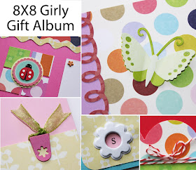
To help their daughter remember her life in Michigan I made her a little gift album full of bright girly colors. It'll be a place for her to put pictures of her bedroom, the house - both inside and out, our neighborhood and town, and all her favorite faces and places to go. Using a coordinating paper pad made it a snap to put together and I'd like to share the layouts in it below.
Cover Page
The idea is for her to add a picture of the outside of the house on this page, the bottom will slip under the border and write her address on the yellow bar.To help them assemble the album, I wrote directions and photo dimensions on each layout. The design plans for a quarter inch white border around each picture, wherever there is a photo mat. I thought this would not only help them place the pictures, but give the sense of continuity to the book. I suggest removing the flower brads, using an unbent paper clip to poke holes through the photos, and then reattaching the photos so the brads are a little detail over the photo.
I tried to include several 4X6 photos so that there would be minimal cropping. Subtle patterns on the yellow and green flowered papers used throughout the book for journaling spots and title blocks look nicer than plain cardstock. Using a nice black felt tip pen will ensure the writing will is legible.
I consider this a filler page with room for four 4X6 photos, a good place for photos of the various rooms in their house.
These pages fit three photos, two horizontal 4X6 photos go on the right side one right over the other. The ends will tuck under the border and the whole thing can be flipped if they want to use vertical photos instead.
This page also has three planned photo spaces. There are lots of fun embellishments on this page like a layered butterfly, three brads, twine, and a heart clip.
Here is the second filler page, idea for pictures of the little girl with her friends. I made the title banner with layers of semi transparent ribbon, for a fun touch. They can crop the photos to cover the pink placeholders completely, this will give them a white border like the rest of the album. Or then can choose to crop a quarter in smaller and have a pink border.
This is the one page I think might be the hardest to visualize. Basically the three vertical photos are staggered across the page. The first and last photos will both cover the ends of the ribbon.
The third and final filler page is near the end. Both sides of the layout have the same basic design, it's just flipped. The punched flowers each have a different colored mini button center.
Here is the last double page spread. I wish I had reversed the placement of the striped and green paper on the left side. It's a case of shoulda, coulda, woulda because this is the one time I used glue stick and once I put it down it was down! The little strip of paper with flower on the right side is folded over and attached on the back of the page so it's easy to slip a photo under it.
There you have it, a quick set of 20 page inserts ready to slide in a standard 8X8 scrapbook that comes with 10 page protectors. I purposely planned for the photos to be standard sizes, or cropped down from standard sizes, and require just straight edge cuts, thinking this would be easiest for someone without an arsenal of tools to help them.
I am really pleased by how it turned out. Now that I've got the basic structure down I can see myself making this gift album again and again, switching it up with different papers to make it suitable for various themes. I have plenty of paper left from the paper pad and am going to make ER one so she can have her own version. We're not planning on moving anytime soon but I think she'll want to look back at her first house when she's older.
What I like about the gift album is that it can be made with minimal extra supplies. It's mainly made up of cardstock and papers, both of which I have an over abundance of. The embellishments are fairly minimal, keeping the cost down after the initial investment of the dies for the borders.
What do you think? Have you ever made a gift album for someone? How did you help recipients who aren't scrapbookers? If you've post it, link me up so I can come see it!

Shared At: Skip to My Lou, Craft-O-Manic, Sew Can Do, Ninth Street Notions, Serendipity and Spice, Sumo's Sweet Stuff, Dear Creatives,


You are so sweet to make their daughter this fabulous book! Oh and I rec'd a package from you last week and am floored! Love, love, love...plan on posting this week all about it :) Thanks sweetie you are the best bloggy buddy ever!
ReplyDeletelove this girly scrapbook!
ReplyDeleteBummer that your friends are moving. I'm sure their daughter will LOVE this book! It's so pretty and girly!
ReplyDelete